
Published on September 23, 2024
Increase Visibility using Performance Analytics
POPX works hard everyday to help our MSP customers improve efficiency, provide better customer service, and grow faster. But what is the best way to track progress? And what specifically should we change in our processes to achieve our goals? After all, you can’t improve what you don’t measure.

We’ve talked to a lot of MSPs who want to improve their customer experience while also cutting costs. Along the way, we’ve picked up some great insights into the key metrics and performance indicators that really matter. We’ve pulled all that together into what we’re calling the ‘Smart MSP dashboard’, which is now a starting point to help our customers transform their business and get the most out of the POPX platform.
The dashboard is built using the powerful and occasionally misunderstood ServiceNow Performance Analytics functionality. In this blog post, we’ll walk you through the Smart MSP dashboard, explaining a little bit about Performance Analytics along the way. The focus is primarily on improving Customer Service and how to get the most value, and fast.
Looking to improve performance over time
You likely already have a reporting dashboard, and if it’s like many of the businesses POPX has spoken to, it probably is focused on the “now”. How many tickets are open? How am I doing on my SLAs? Which are the cases that have been open for a while?
This type of dashboard is tremendous for a Service Desk Manager. It helps to identify what cases should be worked on next, to spot potential issues and deal with any misses.
- But what about comparing the current state to last week, or last year?
- How about making predictions about the future state?
- And what do we need to change in our processes to improve the customer experience and reduce cost?
Performance Analytics is designed to help answer those questions.
Starting with the key performance measures
So, where do you start? While every business is unique, at POPX we see that many MSPs have a certain commonality. So consider the Smart MSP dashboard as the first step, designed to be adapted and adjusted, but with a solid foundation that allows you to get insights quickly.
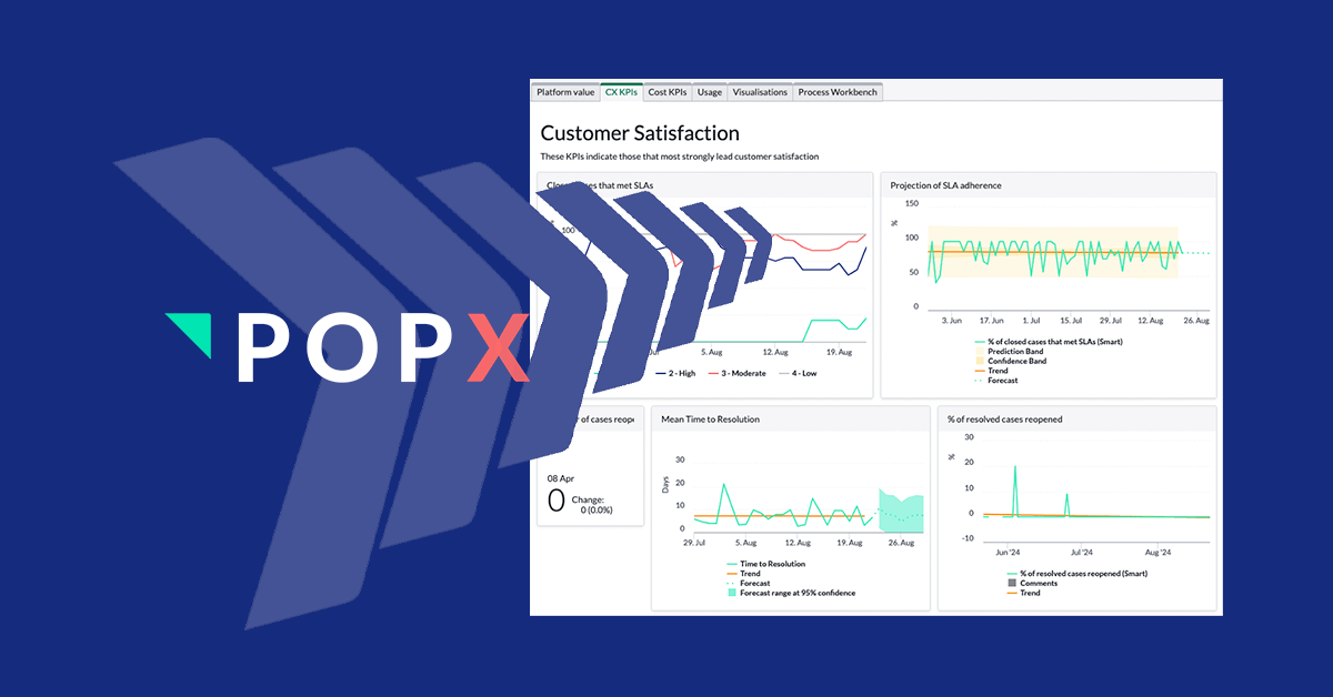
1. Customer Experience
Ultimately, providing a better customer experience will mean your renewal rates will increase, churn will reduce, and your NPS and CSAT scores will reflect your customers happiness. But what are the key things you should be doing on a day-to-day basis to help improve them?
When something goes wrong, and a case needs to be raised, you naturally want a quick fix. So one of the most important graphs on the Smart MSP dashboard is the mean time to resolution (MTTR), which records the time it takes from beginning to end.
But some cases are more urgent than others, and you will have also promised your customers to resolve issues within a certain timeframe. So showing your adherence to your Service Level Agreements (SLAs) is also critical.
On the dashboard, both of these metrics are shown over time. Is the performance improving or declining? If you’ve focused on your priority 1 cases, are your lower priority cases being affected?
Most Performance Analytics (PA) graphs are shown over time, since it helps understand trends. In general, PA works by capturing value for every metric every day, giving a rich source of data to compare and look back on. But more than that, with forecasting, you can look to the future too.
Performance Analytics uses several different forecasting methods, including linear, seasonal and random forest, and the Smart MSP dashboard presents this information in a visual way.

Of course, there are many other metrics that can help to understand the customer experience. The dashboard also includes the percent of cases reopened, since while a fast case resolution is great, it is not so wonderful if it doesn’t actually fix the issue. And MSPs that are able to be more proactive with their customers, to fix issues before they are complained about, are often held in higher regard!
2. Cost
The cost tab of the Smart MSP dashboard shows the key performance indicators (KPIs) on how much time and effort is being spent on handling cases. Many POPX customers have a particular focus on this area!
Reducing the cost per ticket is an aim for most MSPs. Performance Analytics makes it easy to combine data sources, so taking the average loaded cost of an agent, and then combining that with the time worked per case gives you a view over time. Breakdowns make it easy to see that cost per case for a particular group, customer, service or more. This is incredibly powerful: did you wonder if a certain offering costs you more to support? Now you know!
One area of increasing interest is revenue leakage. In particular, POPX has found that MSPs are overserving their customers, and delivering more than are contractually obliged to. While some level of this may be acceptable - in order to increase customer satisfaction - it should be measured and analysed to be kept in balance.
The POPX approach to measuring over-service is through entitlements. Perhaps your MSP has sold a service where your customer is allowed 10 changes a month? Or perhaps break-fix is included, and consultancy is not. This detail is captured, and then the system can automatically track how those entitlements are being used, and highlight which customers are exceeding their pre-agreed limits.
Of course, we’ve also spoken to MSPs who struggle to get this level of data, because their records are incomplete. So the Smart MSP dashboard shows how frequently service is given without that tracking in place.
Finally, the cost tab includes a wealth of information on how many cases each agent is resolving, to give a level of efficiency and utilisation. How many cases are being closed per agent? And how often does reassignment happen? And if you can increase your first contact fix rate, you’ll typically save money.


Understanding the use of the POPX Platform
Focusing on the cost and customer experience metrics is a great place to start. But making sure you are taking advantage of the POPX platform will help set you up for growth, and unlock more areas for process improvement.
Platform automation
The KPIs in the platform tab focus on automation. While many MSPs are moving away from expensive phone calls, and onto technology like chat, inbound emails still make up the largest portion of case creation mechanisms. While emails are typically convenient for the end-user, it means they miss out on the knowledge base and other self-service tools. For example, sending an email to raise a case to reset a password can be a slow and painful process.
Many MSPs have found significant cost savings and improvements to the customer experience by encouraging more portal and self-service use. So, the Smart MSP dashboard contains visualisations on the level of portal usage, and functionality like Virtual Agent and auto issue resolution can be tracked in order to improve.
Further, as we discussed in a previous blog, Task Intelligence is a powerful way to set the category or assignment group on a case. These automations, along with others, such as the number of configuration items (CIs) discovered and updated automatically - meaning manual updates are not necessary - can be monitored to show the progress of any process improvement initiatives.

Usage and visualisations
Performance Analytics provides many different visualisations to better understand how your processes are performing, and where changes may better help. The usage tab of the Smart MSP dashboard shows consumption of some of the ITIL aligned artefacts, like incident, problem, change requests and more. Through the analysis of your cases, you may have seen, for example, that there is a challenge with understanding why some technical cases keep repeating. Is problem management being used? Perhaps a campaign around the benefits, or a refresh of the functionality would help?
In addition, some example visualisation to better understand the content of your cases are available, showing the most frequent words in a word cloud. Is “password” coming up a lot?


Process Workbench
Finally, the process workbench gives even deeper insights. Almost all the graphs and visualisations on the Smart MSP dashboard can be drilled into, to change the time frame, see different breakdowns, alter the averages and add projections. But the process workbench provides many breakdowns in a very visual way.
For example, perhaps we look at the cases that are between 6 and 30 days old, which are the ones that have taken longer to resolve? Is there a particular service that stands out? Or does one support team have more than others? You can access full details of cases with just a couple of clicks.

Taking advantage of the Smart MSP dashboard
The Smart MSP dashboard gives you a great starting point to understand and improve your processes, and get more value out of the POPX platform.
Many POPX customers have found it useful to achieve their goals of reducing cost, increasing customer experience and being ready for growth.
So, be inspired by some of the visualisations, by the information presented, and, working alongside POPX to adapt it to fully meet your business objectives.
If you’d like to learn more about becoming a Smart MSP or the POPX platform in general, please get in touch, and we’ll happily dive into more detail.